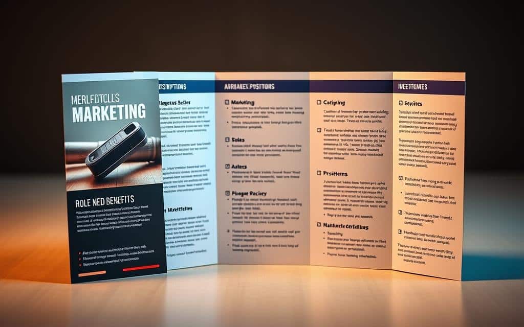
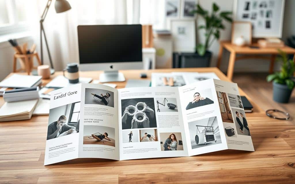
85% of marketers say printed materials remain their most trusted tool for building brand credibility. Among these, the tri-fold brochure stands out as a versatile workhorse—compact enough to fit in a pocket yet powerful enough to command attention in crowded markets.
This six-panel format folds neatly into thirds, creating a natural flow for storytelling. Over decades, it’s evolved from simple handouts to strategic assets that blend tactile appeal with digital integration. Modern versions often feature QR codes linking to videos or booking systems, merging physical and online engagement.
Your brochure’s impact hinges on three pillars: paper quality, precision printing, and purposeful design. Thick matte stock conveys luxury, while glossy finishes pop under retail lighting. As noted in this comprehensive guide, strategic content placement transforms basic pamphlets into conversion drivers.
When executed well, these materials do more than advertise services—they become brand ambassadors. A study by Color Vision shows 68% of consumers judge companies based on brochure quality, proving first impressions start at the front cover.
Key Takeaways
- Tri-fold brochures deliver information in three panels for easy navigation
- Paper weight and finish directly influence perceived brand value
- Effective designs balance visuals with clear calls-to-action
- Direct mail campaigns see 23% higher response rates with personalized brochures
- Proper layout guides readers from problem to solution seamlessly
Exploring the Role of Tri-Fold Brochures in Marketing
Since the 1920s, folded paper formats have shaped how businesses communicate. The tri-fold brochure emerged as a practical solution for sales teams needing portable sales tools. Its letter fold design—two inward folds creating six panels—became standard for trade shows and direct mail campaigns.

Understanding Tri-Fold Brochures and Their Evolution
Early versions used basic paper stock with single-color printing. By the 1980s, advancements in offset printing allowed vibrant graphics and coated papers. Today’s options include textured stocks and UV coatings that resist wear. Catdi Printing reports 89% of clients now choose matte or linen finishes for premium appeal.
| Fold Type | Year Introduced | Common Uses | Best For |
|---|---|---|---|
| Letter Fold | 1923 | Product catalogs | Detailed specs |
| C-Fold | 1958 | Event programs | Sequential storytelling |
Benefits and Versatility for Businesses
Evenly divided panels let you showcase services chronologically: problem (panel 1), solution (panel 3), call-to-action (panel 6). Color Vision’s study found this layout increases reader retention by 41% compared to flat sheets.
Modern designs balance high-quality imagery with white space. Durable 100lb text weight papers survive mailing cycles, while spot gloss accents draw eyes to key offers. Whether promoting healthcare services or tech products, this format adapts to your brand voice without redesign costs.
What Kind of Advertising is a Trifold
In a world saturated with digital ads, tri-fold brochures command attention through smart design choices. These portable marketing tools convert casual readers into customers when visuals and text work in harmony.

Design Elements That Engage Your Audience
Great brochures start with two-font maximum rules. Pair a bold header font with a simple sans-serif body text. High-resolution images (300 DPI minimum) prevent pixelation during printing.
Use bullet points to break up dense information:
- Highlight key services in shaded boxes
- Place contact details in contrasting colors
- Reserve 30% white space per panel
“The front panel acts as your storefront window—make viewers want to step inside.”
Optimizing Layouts for Maximum Impact
Z-fold brochures work best for timelines, while gatefolds create dramatic reveals. Always test mockups—critical content shouldn’t hide in creases.
| Panel | Content Purpose | Visual Ratio |
|---|---|---|
| Front | Brand identity | 70% image |
| Middle | Service details | 50/50 split |
| Back | Call-to-action | 30% image |
Tech startup CircuitFlow increased demo requests by 18% using this approach. Their middle panels showed product specs, while the back offered QR-linked video tutorials.
Remember: Every design choice should guide readers toward your final CTA. Balance promotional language with actionable advice to build trust.
Designing Effective Tri-Fold Materials for Your Business
Your brochure’s physical feel shapes first impressions before a single word gets read. Catdi Printing’s research shows 73% of recipients judge company professionalism based on paper texture alone. Let’s break down how material choices and layout strategies turn folded paper into persuasive marketing tools.
Choosing the Right Paper, Stock, and Finishes
Matte finishes convey sophistication for law firms or architects, while glossy stocks make food photos shine. Consider these options:
| Finish Type | Perceived Value | Best Use Cases | Durability |
|---|---|---|---|
| Matte | Premium | Corporate brands | Resists fingerprints |
| Glossy | Vibrant | Product catalogs | Scratch-resistant |
| Linen | Artisanal | Craft businesses | Hides creases |
Color Vision recommends 100lb text weight for mailers—thick enough to feel substantial, thin enough for standard postage. UV coatings protect high-traffic areas like contact panels.
Creating Compelling Content for Each Panel
Front panels need bold headlines and striking visuals. Middle sections should detail services using bullet points and infographics. Save technical specs for inner panels where engaged readers will seek them.
Allocate space wisely:
– Panel 1: Attention-grabbing headline
– Panels 2-3: Core product benefits
– Panel 6: Clear call-to-action with QR code
Balancing Visuals and Text Strategically
Follow the 70/30 rule—70% white space and images, 30% text. Pair a decorative font for headers with clean sans-serif body text. Avoid cluttering panels; let each element breathe.
“Great design whispers ‘quality’ through intentional emptiness between elements.”
Use shaded boxes to highlight key services without overwhelming readers. Remember: Your tri-fold brochure isn’t a novel—it’s a visual roadmap to your best offerings.
Leveraging Trifold Brochures in Direct Mail and Promotional Campaigns
Direct mail campaigns using tri-fold brochures achieve 23% higher response rates than digital-only efforts. Their physical nature cuts through email clutter while offering tangible value recipients often keep for weeks.
Integrating Strong Calls-to-Action into Your Design
Effective CTAs work like road signs—clear, urgent, and impossible to miss. Place them in high-visibility areas:
- Back panel center for immediate visibility when unfolded
- QR codes linking to landing pages with tracking capabilities
- Limited-time offers in contrasting colors (red increases conversions by 17%)
Always test fold alignment—key CTAs should never land in creases. Professional printing services ensure crisp edges for scannable codes and readable text.
Enhancing Brand Awareness with High-Quality Imagery
Premium imagery makes brands memorable. Use 300 DPI resolution images that maintain clarity when printed. Align visuals with your brand palette—consistent colors increase recognition by 80%.
| Image Type | Best Use | Impact Factor |
|---|---|---|
| Product Shots | Front Panel | 47% higher engagement |
| Team Photos | Inner Panels | Builds trust |
| Infographics | Middle Spread | Simplifies complex data |
Local bakery Sweet Crust saw 31% more catering orders after upgrading to full-bleed food photography in their mailers. Glossy paper finishes made their desserts look professionally styled.
Conclusion
Tri-fold brochures remain unmatched for blending portability with persuasive power. Their six-panel structure—refined through decades of marketing evolution—delivers complex messages through strategic visual storytelling. When paired with direct mail campaigns, these materials achieve 23% higher engagement than digital alternatives.
Success hinges on three pillars: intentional design, premium materials, and clear calls-to-action. Glossy paper elevates product photography, while matte finishes convey professionalism. Always position contact details and QR codes away from fold lines to maintain readability.
Remember these essentials:
– Use contrasting colors for critical offers
– Allocate 30% white space per panel
– Partner with professional printing services for crisp execution
Your brochure acts as a silent salesperson. It builds brand awareness through tactile experiences digital ads can’t replicate. Whether promoting services or new products, every crease and corner should guide readers toward meaningful action.
Ready to transform your marketing? Consult experienced printing specialists to craft materials that reflect your brand’s excellence—and convert casual readers into loyal customers.
